
Many who attended the "COLOR" with Mary Anne Smiley Seminar at Mary Tomas Gallery, Dallas have asked for a recap of the slide presentation. So here goes, a scaled down version of the main points.
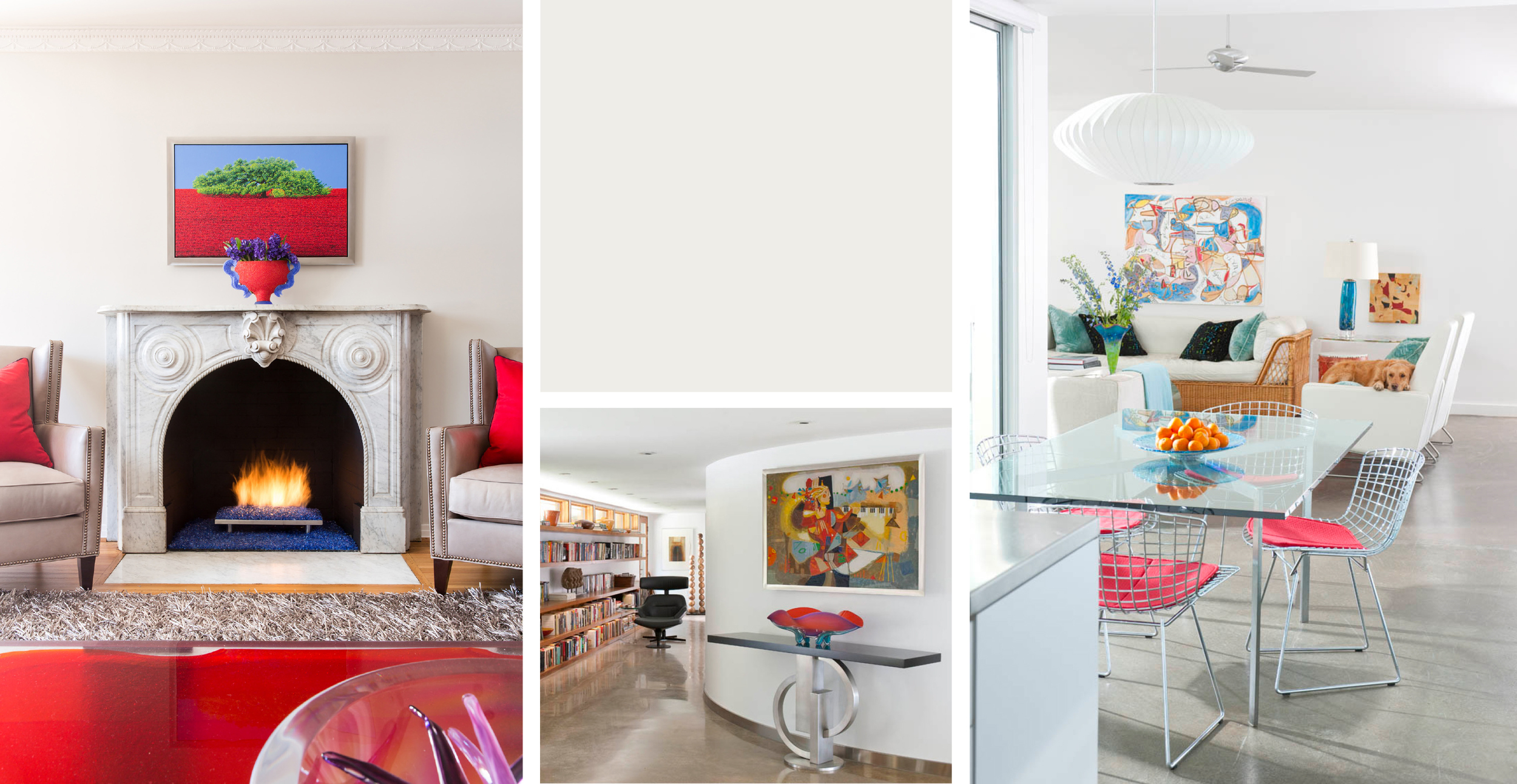
Though I am known for my bold use of strong colors, observers often miss that I rarely ever use strong colors on walls.
COLOR RULE #1 USE PURE COLOR IN SMALL AMOUNTS!
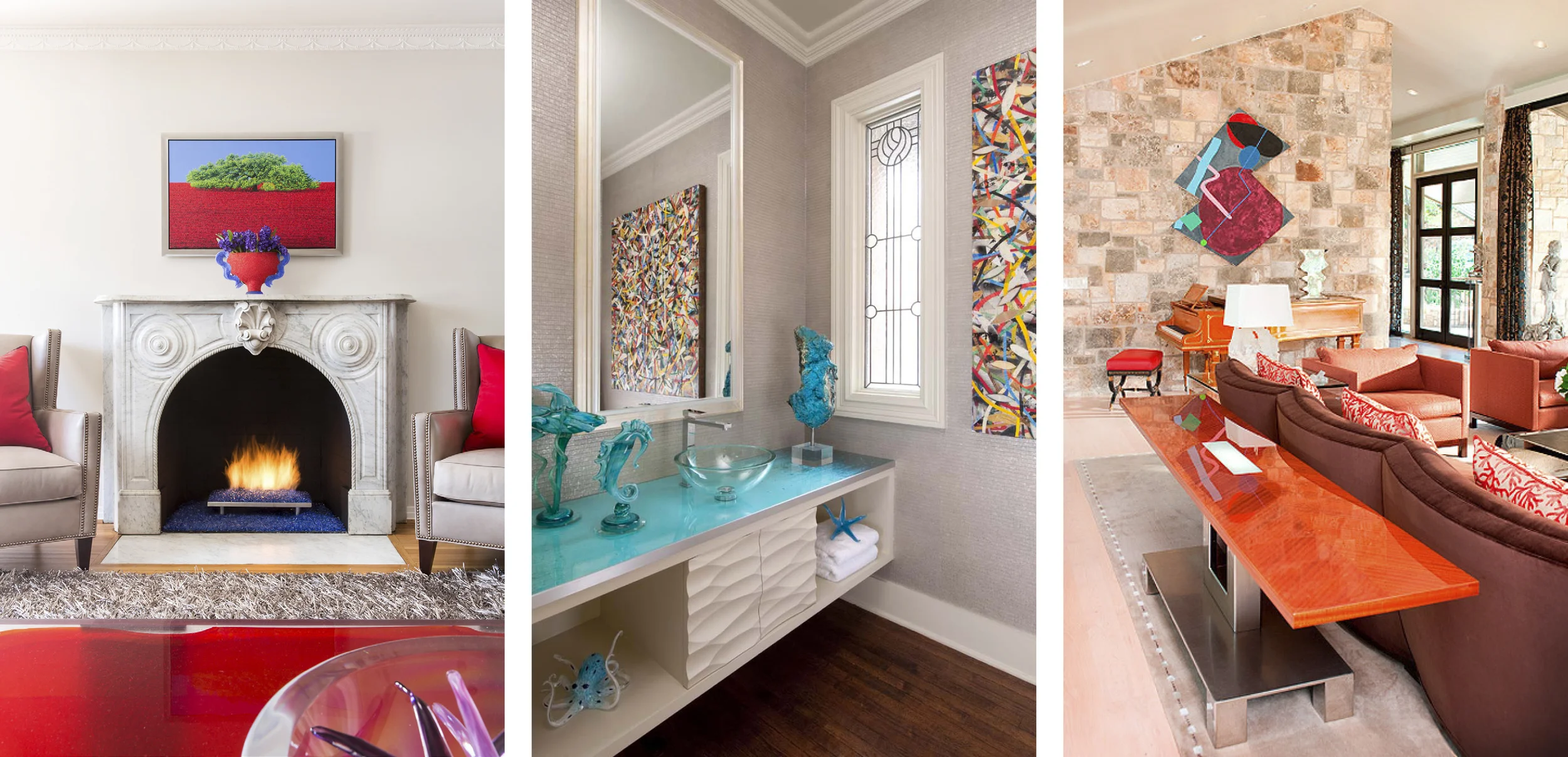
COLOR FREEDOM means NEUTRAL BACKGROUND! To be able to use the strong colors that I love without over saturating the room with too much color, I have learned to always start with soft neutral backgrounds. Then pop the strong color in small amounts on pillows, furnishings, accessories, and art. The neutral background allows the small pops of color to dominate, giving the impression that the room has much more color than it actually has!
COLOR RULE #2 COLOR FREEDOM MEANS NEUTRAL BACKGROUND
Here are 4 neutral backgrounds that I have used over and over again for perfect settings for all that fun color...
The first is "Window Pane" from Sherwin Williams. This soft translucent sky color seems almost transparent and works in any setting to create an elegant airy background, perfect with any color in art and accents colors.

The second background I love and use often especially with particularly contemporary settings is "Pure White" by Sherwin Williams. Nothing makes pure color pop like pure white!
The third neutral is my go to neutral over many years, Sherwin Williams Rice Grain. I have specified thousands of gallons of this wonderful color in projects from contemporary to glam to traditional. It is very illusive and seems to know what cast to take for each setting, sometimes showing a golden cast, sometimes soft beige, sometimes soft grey green. It adds class and distinction to any space. It never disappoints!

The fourth neutral that I love to use is Repose Grey from Sherwin Williams. This soft lovely color almost looks like velvet on the wall and is especially nice in soft contemporary settings, and can be very restful, yet striking when used with my favorite color pops!!!

COLOR RULE #3 CONSIDER BACKGROUNDS
Before painting, it is critically important to consider the wall finish. Because I use so much art, for years I have demanded that all wall finishes in my projects be LEVEL 5 WALL FINISH. This means it is a perfectly smooth finish with no texture whatsoever. It is the preferred finish for museums and the finest art galleries. The reason is that art is jealous for our visual attention!!! It does not want our eye distracted away from focusing on the art by a busy wall finish. Rough wall finishes create tiny shadows all over the surface of the wall which are visually very distracting, making it harder for our eye to totally focus on the focal point art!

Level 0- Used in temporary construction. No taping or finishing is required Level 1- Joint tape need not be covered with joint compound. The surface is left free of excess joint compound. Ridges and tool marks are acceptable Level 2- All joints shall have tape embedded in joint compound and wiped with a joint knife. Surface left free of excess joint compound Level 3- All joints and Interior angles shall be covered with two separate coats of joint compound. Level 4- All joints and interior angles shall be covered with three separate coats of joint compound. Level 5- All joints and interior angles shall be covered with four separate coats of joint compound.

When the level 5 finish is painted with a smooth rubber roller that will leave no texture or stipple, but leave a beautiful pearl finish, a paint of the lowest sheen can be added to create the most stunning background for any setting! Equally as beautiful as Venetian Plaster for much less money.

The difference between Level 5 (right) and any basic wall texture (left)
True to my rule of strong color in small amounts, I do actually like to use strong color on walls in rooms with limited wall space. Here is a reason why:
Consider the paint sample below, and how many times the size of that small sample will be multiplied when applied to the wall.

On a 6' x 9' wall, it will be multiplied over 17,000 times!!! No wonder the color intensifies so much on a large area!
It is also the reason that choosing a color from a color swatch is such an imperfect science. No one can imagine what the swatrch will look like when you see 17,000 times that amount on the wall. The color often not only will be too strong, but also will exhibit a hue that you could not discern on the small sample.
COLOR RULE #4 GO FOR IT! PICK A COLOR!

SO! Always do a sample before purchasing paint!!!
What do you do when the lime green you wanted for your powder room looks aqua blue on the sample?! That is when we go back to the old color wheel!!!
BACK TO COLOR WHEEL 101: ADJUSTING WALL COLOR


If you know that opposite colors on the color wheel are complimentary colors, and that by mixing complimentary colors results in a neutral gray, you know that you can use the complimentary color of any color to neutralize it when it is now wanted.
So, to get rid of the blue in the blue green paint, you would add the complimentary color of blue, which is orange, starting with the smallest possible amount, as a little goes a long way. The result will be to neutralize the blue and let the green come to the forefront!
This is very important knowledge that will not only impress the paint counter salesman when you ask him to make this addition, but will also allow you to create the exact colors you desire without having to rely on sticking to fan deck colors.

POWDER ROOM THEORY
The powder room is a great room to do bright colors in. People have time to consider every detail.
So now, armed with this knowledge, you can be confident about choosing that bright lime green or coral for the powder bath or other small area.
Go fourth and enjoy COLOR! COLOR! COLOR! Even if in small amounts after all!

TO SEE A VIDEO OF THE LECTURE CLICK HERE


Photography curtisy of Klik Designs